How to Sample Paint Colors Before Choosing a Wall Color
Paint color sampling helps you compare undertones, finish, and fixed furnishings on movable boards, so you can choose a wall color with clearer context.
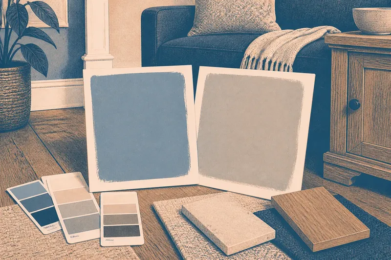
Which paint color will still feel right beside your floor, sofa, and trim? Paint color sampling helps answer that by putting actual paint next to the room’s fixed materials, rather than asking a small store card to stand in for a wall.
Cards and paint samples
Start with color cards to narrow the field. Lay a few candidates side by side, then compare each with the floor, window trim, countertop, or large furniture that will remain in the room. A neutral can reveal a green, pink, or violet undertone when placed beside another color; the relationship is useful information, not a change in the paint itself.
A card is printed, while a painted sample shows the actual product and finish. A sample can reveal whether the color seems too vivid, dull, warm, or cool beside your materials. It still cannot reproduce every wall at once: a small patch is surrounded by more of its existing background than a fully painted room would be.
Movable sample boards
Paintable poster board or another suitable primed board lets you compare one sample in different spots without coating several walls. Choose boards that are large enough to judge comfortably and manageable enough to move. Apply the paint and finish you expect to use, following the product label; note the color name and finish on the back so the candidates do not get mixed up.
Compare boards against fixed features first, then place them beside furnishings that matter to the room’s use. A blue-gray may suit a pale rug but clash with a warm wood cabinet; a softer green may sit more quietly alongside both. The board is like a menu beside the dish: it helps you assess the choice in context, but it cannot reproduce the whole experience.
A clear comparison
Keep the process focused. Too many candidates make it harder to remember which difference matters. Use this sequence to turn observations into decisions:
- Check the fixed finishes: Hold each card beside the floor, trim, and countertop. If one candidate makes a permanent material look unexpectedly pink or green, remove it from the shortlist; if it sits comfortably beside all three, keep it.
- Check the furnishings: Place a sample board near the largest sofa, rug, or cabinet. If the paint competes with a prominent fabric or wood tone, try another candidate; if the pairing feels balanced, retain it for closer comparison.
- Check the actual paint: Use the intended product and finish on a primed board. If the sample looks markedly different from its card, judge the painted board rather than the card; if they remain similar, use the card for quick side-by-side sorting.
- Check the background: Move the board so it covers the old wall color behind the sample. If the old color changes the apparent result around its edges, reposition the board or use a different neutral backing; if the sample reads clearly, continue.
- Check the finish: Compare a board painted in the finish you plan to use. If another finish reflects more light than you want, choose the intended finish for your decision; if the sheen suits the room, keep that sample as your reference.
- Check the room’s purpose: Put the sample near the activity area, such as a reading chair or dining table. If the color feels distracting where you want a calm backdrop, compare a quieter candidate; if it supports the room’s intended mood, keep it in the final pair.
- Check the label: Read the color name and finish from the board’s back before making a note. If either is unclear, relabel it before comparing further; if both are legible, record the candidate accurately.
Questions about sampling?
Where should I place a paint sample?
Set a movable board beside fixed finishes and important furnishings, then try it in more than one part of the room. If a color works only away from a dominant rug or cabinet, keep comparing instead of treating that one position as decisive.
How large should a paint sample be?
Choose a board large enough to judge the color without squinting, but still easy to move and store. If subtle undertones disappear on a tiny card, use a larger painted surface; if a board is cumbersome, choose a smaller one that remains readable.
Should I sample the final paint finish?
Yes, when possible, use the finish you expect on the wall. If a sample in another finish looks glossier or flatter, do not use it as the final color reference; repaint a board in the intended finish.
Can a sample predict the whole room?
No small sample can show exactly how every wall will feel once painted. If the sample seems borderline, compare a second board and account for the room’s fixed colors before deciding; if it remains a strong match, keep it as the leading candidate rather than treating it as a perfect preview.
A worked comparison
Say you have a living room with oak flooring, a charcoal sofa, and two candidate paints: a muted blue-gray and a warmer gray. These are invented colors for this example. First, you hold both cards beside the oak and sofa; the blue-gray looks cooler beside the wood, while the warmer gray appears slightly pink beside the sofa. Next, you paint two primed boards in the intended finish and label their backs. You place each board beside the sofa, then beside the oak floor. The blue-gray’s cool cast remains noticeable near the wood; the warmer gray’s pink cast remains noticeable near the sofa. Your decision is to keep comparing rather than select either from the cards alone, because each has a tradeoff against a prominent fixed feature. If you prefer the cooler wood pairing over the pink sofa pairing, retain the blue-gray as the finalist; if the sofa pairing matters more, retain the warmer gray.
Choosing with context
When two options remain close, place their boards side by side in the same location and compare them against the same furnishing. This reduces reliance on memory. Record the color name, finish, and the material beside which each sample looked strongest or weakest.
Once you choose, keep the labeled board as a reference for the selected color. Paint color sampling is most useful when each comparison answers a specific question: which undertone suits the floor, which finish works with the room, or which color supports its use? The board cannot make the room’s decision for you, but it can make the tradeoffs visible before you commit.