North Light or South Light? Reading a Window’s Aspect
North light or south light can shift a room’s colors and fabrics through the day. Learn what to observe before settling on finishes for your windows.

Will that soft gray look calm beside your window, or turn cold by afternoon? North light or south light changes how colors, fabrics, and finishes read, so the room’s aspect is useful evidence before you choose them. A window’s compass direction is only the first clue: clouds, nearby buildings, trees, glass, and the hour all shape what reaches the room.
Use these observations to understand the light you actually live with. Rather than treating an orientation as a color rule, look at its changing character and decide what atmosphere you want the room to hold.
1. Find the window’s aspect
Aspect means the direction a window faces. In the Northern Hemisphere, north-facing windows generally receive little direct sun, while south-facing windows can receive more direct sun across the day. East-facing rooms tend to catch morning sun; west-facing ones often receive stronger late-day sun. In the Southern Hemisphere, the broad north-south pattern reverses.
A compass app can help identify a direction, but stand at the window and check what the view allows. A neighboring building may block low sun; an overhanging roof can shade a bright elevation. A tree’s foliage, the depth of the window reveal, and a balcony above can also soften or redirect daylight. The orientation describes the opening, not a promise about the light inside.
Also note the room’s purpose and the hours you use it. A kitchen used in the morning may feel different from a sitting room occupied after work, even if both have windows of the same aspect. Your own schedule is part of the room’s light conditions.
2. Read north-facing light
North-facing light is often indirect and relatively steady. Because direct sun is limited, it can reveal subtle surface texture without the sharp shifts that a sunbeam brings. The tradeoff is that a room may feel muted, particularly under heavy cloud or when the window is shaded by a narrow courtyard.
Cool colors can appear especially crisp in this setting, while some warm neutrals may seem more restrained than expected. That does not make north light a reason to avoid blue, gray, or white. It simply means a pale color’s undertone and the surrounding materials may become more noticeable. A cream wall beside honey-colored oak may read differently from the same cream beside polished concrete.
Fabric can respond just as distinctly. A deep green curtain may look rich but lose some of its liveliness in a dim corner; a nubby wool or linen blend can supply visible texture even when the color shifts little. Think of daylight as a filter over a familiar object: it changes the impression without changing the object itself.
3. Read south-facing light
South-facing windows in the Northern Hemisphere can receive bright direct sun, though its angle and reach change with the season and the surroundings. Sunlit walls may look warmer and more vivid than the shaded parts of the same room. A paint color that feels gentle on one wall might appear bolder where a beam lands.
Light can also bring out variation in textiles. A woven curtain, rug, or sofa fabric may show its threads and color shifts clearly in direct sun, then look quieter when the sun moves away. Glossy surfaces can produce glare, while matte finishes tend to scatter reflected light more softly. These are visual effects to weigh against how you want the room to feel, not automatic reasons to choose or reject a material.
Notice where direct sun falls and whether it interferes with reading, screen use, or another regular activity. Window coverings can change the light’s intensity and direction, but their fabric and color also become part of the view. If the room gets bright at a particular time, assess both the uncovered window and the filtered light you expect to use.
4. Track the whole day
A single glance gives you a snapshot, not a pattern. Observe the room in the morning, around midday, and later when you usually use it. On each visit, note whether the light is direct or diffuse, which surfaces catch it, and whether the room feels bright, flat, warm, or cool. Repeat on a clear day and a cloudy one if both are common where you live.
Keep the notes plain. “Sun reaches the dining table before lunch” is more useful than “beautiful light”; “the wall beside the bookcase stays dim” points to a specific design decision. You can also photograph the same corner at different times, keeping the camera position steady. Treat phone images cautiously, since automatic exposure and screen settings can alter the apparent color.
Imagine you are choosing curtains for a west-facing bedroom. You notice a strong patch of late sun on the floor, while the window wall looks subdued in the morning. That observation suggests looking at the fabric in both conditions: you can judge whether its color turns too vivid in the sun and whether it still has enough presence earlier in the day.
5. Check color and fabric
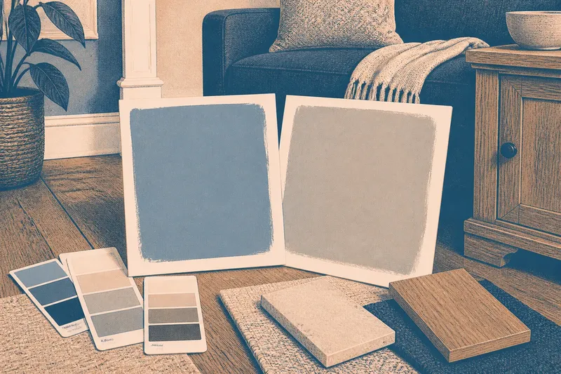
Once you have observed the room, view candidate finishes where they will actually sit. Hold a fabric against the window and then against the wall; look at a paint sample on more than one wall, including a shaded area. A swatch’s appearance on a small card may not convey the way a larger surface receives light or relates to timber, flooring, and upholstery.
Compare choices under the room’s usual conditions rather than relying on a showroom impression. If a fabric is intended for a sunny window, examine its color with the curtain open and with the kind of filtering you plan to use. For upholstery, consider the seat’s position as well as the room’s overall aspect. A sofa tucked into shade may read differently from a chair beside the glass.
Ask what you want the finish to contribute. A warm color can bring a sense of warmth to a cooler-looking room; a muted textile can temper a bright one. Texture, sheen, and pattern matter too. A matte weave may feel quieter than a smooth satin in a bright patch, even when both share a similar color.
6. Choose with the room in mind
Orientation helps explain what you see, but it does not dictate a palette. A north-facing room can suit cool, restrained colors if that is the intended mood; a south-facing room can still feel composed with rich tones and textured fabric. The useful choice is the one that works with the room’s actual light, its furnishings, and the hours you spend there.
Before committing, check the sample at the times that matter to you, beside the finishes it must live with. North light or south light is a starting point for that observation, not a verdict. When a room’s view is blocked or the light varies sharply, your notes from the window will tell you more than the compass alone.
Questions about aspect?
Does north light always look cool?
No. It is often indirect, but nearby surfaces, glazing, weather, and interior finishes affect the impression. Look at the room itself before assuming a particular color will feel cold.
Is south light always bright?
Not necessarily. Trees, buildings, roof overhangs, and window depth may limit direct sun, while clouds change its intensity. Observe the window at the hours you use the room.
Which direction is best for a color-sensitive room?
There is no single best aspect. Choose colors by viewing them in the room’s changing light and deciding which appearance you prefer across your normal day.
Can artificial lighting replace daylight?
Artificial lighting can support a room after dark, but its color appearance may differ from daylight. Consider the bulbs and fixtures you plan to use alongside the window’s natural light.
Before you settle on a fabric or paint, write down the room’s most useful light observation and the time it occurs. That small note keeps the decision tied to the way you inhabit the room, rather than to a direction on a compass alone.